
Ligature Logos
- Nov 28, 2016
- 2 min read


Ligature Logo Project: Taner CeylanDate: 11/23/16
What is a ligature logo?Letters that are tied making a uniform design that is great for companies.
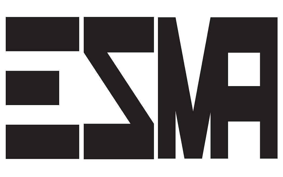
How would describe the corporate identity of ESMA in 5 words? I would describe ESMA as hip-hop with style and swag.
Which logo out of the two do you feel is the strongest and why?I feel like my logo with the box letters is the strongest because it fits the identity of Epic Records.
If you had no requirements or restrictions how would your logo look different?I would incorporate more color into my designs.
Explain which ligature techniques you have demonstrated on each logo: My first logo with the box letters I cut the “S” on the bottom and used direct selection to connect it to the “E”. I also Shape built the bottom of the “M” with the top of the “A”. Finally I used the live paint bucket for the color version to fill with red on the inside of the letters and fill with black on the outlining of the letters.My second logo has a flashy look with big letters and hard edges. I cut the whole vertical stroke of the “E” and left the three horizontal lines. The “S” I used a Hard edge font instead of the usual round “S”. Both “M” and “A” also have the squared font and I Used shape builder to connect the two letters. I used Direct Selection to fix certain spots of letters to make my logo look better. Finally, I used live paint bucket in the color version with a black fill inside the letters and a green, sharp, and electric looking gradient.


Comments